

P&O Cruise Line | The Pantry • Branding & Environmental Graphics
Client requested a rustic, yet beachy/cute feel; a shipping container that had been converted to a small, locally-owned hidden gem on the beach that just so happens to serve the most incredible tacos.
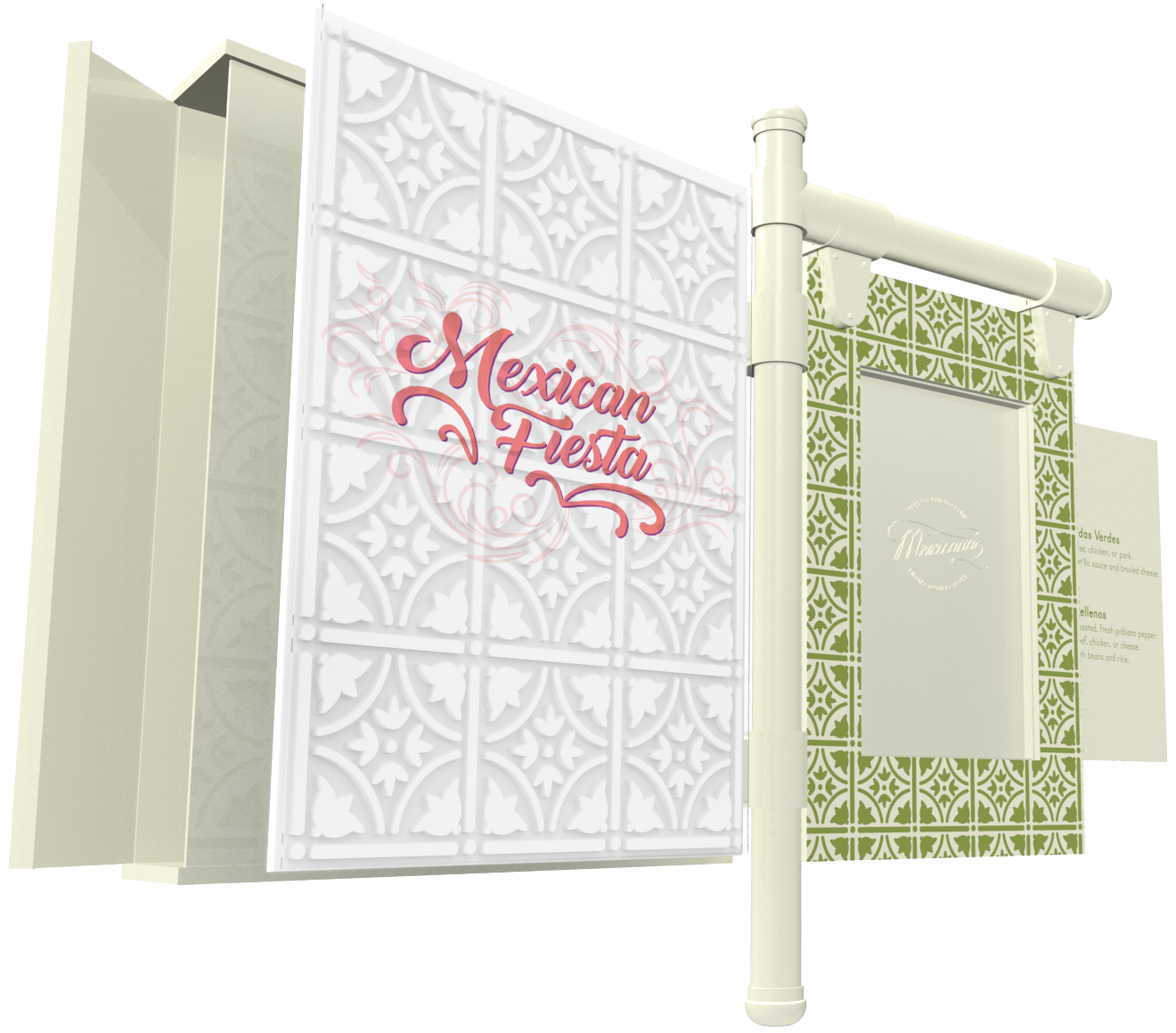
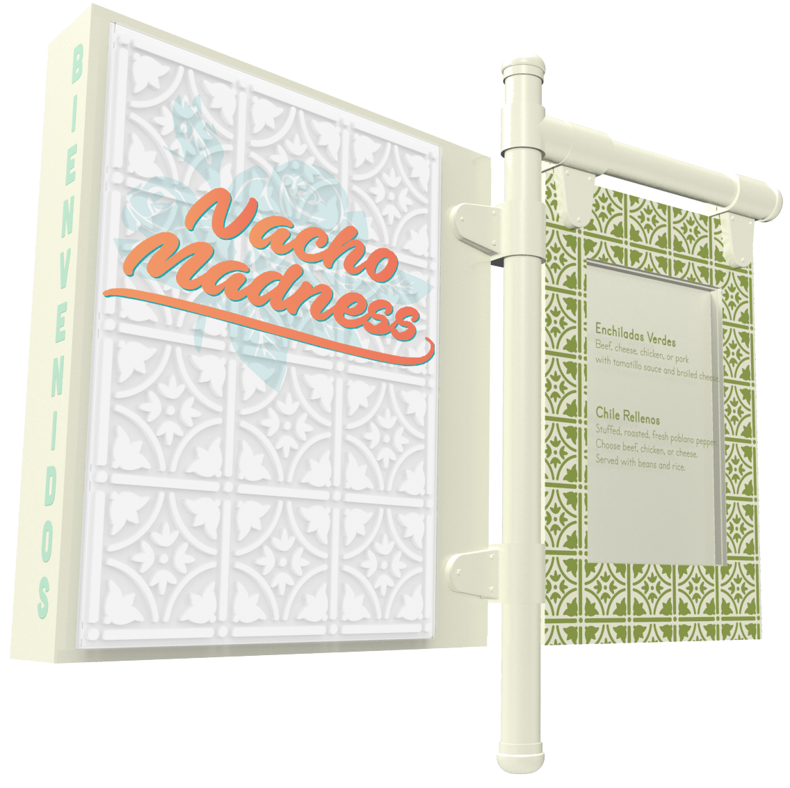
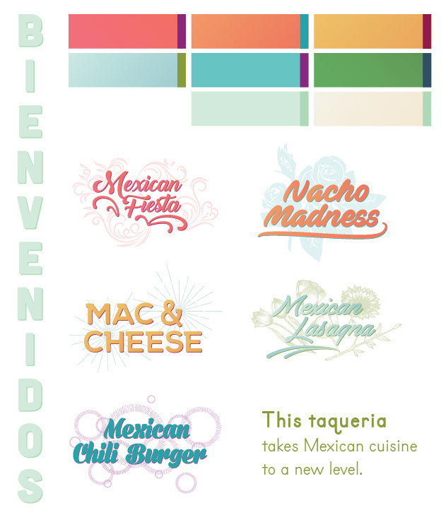
A fresh, bright, airy color palette with juicy and spicy color combos. Two display typeface choices, as well as menu theme logos (painted on glass and inserted in front of a white enamel tile) to go with the daily menu printed on-board the ship. I focused on delicate patterns interacting with strong typeface choices to create a bold, high-contrast look.
Sticking with light, bright, and airy colors, we chose to source reclaimed materials in heavier mediums to follow the high-contrast design feel. By utilizing steel hinges and pipes from retired shipping containers and recycled ceramic Mexican tiles, we created a unique blend of updated old materials. Crisp graphics interacting with destructed materials gave us the perfect Mexican-taqueria-on-the-beach vibes.
In order to reduce the amount of moving parts, each themed menu piece can be stored in the built-in cabinet within the sign. The daily menu can be printed on-board the ship for ease of use and lowered cost. When no daily menu is in place, the Mexicana branding can be seen laser-etched into the backer of the sign.
In collaboration with Drake Durant.
